Entry and landing page
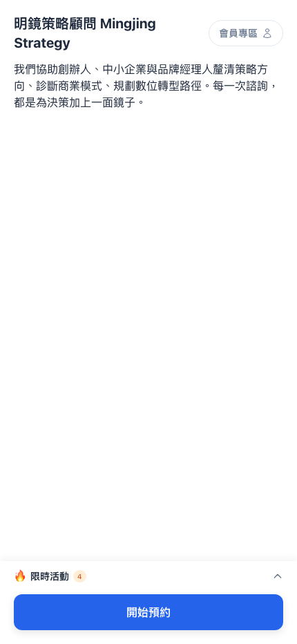
This is the first screen a client sees on entering from LINE — your shopfront on their phone. Everything that follows (browsing services, booking, member actions) starts here. This page breaks that screen down, covers how clients arrive, and explains which of the two landing modes to choose.
What's on the screen?
Following the screenshot above, top to bottom:
| Block | Purpose | Where it's configured |
|---|---|---|
| Business name | The brand name the client sees first | System settings → Business home page |
| Member area button (top right) | Opens their own bookings, points and tickets | Shown automatically; nothing to configure |
| Business description | Three to five sentences on what you do | System settings → Business home page |
| Current campaigns 🔥 (bottom drawer) | The offers currently running | Populated automatically once created under campaigns |
| The large Start booking button | Opens the service list | Always at the bottom; can't be removed |
Question: Why is the Start booking button pinned to the bottom?
The thumb-reachable zone on a phone is the bottom, not the top. Pinning the primary call to action there means it's tappable however far the client has scrolled — the highest-converting convention on mobile (Booking.com, Airbnb and Uber Eats all do it).
If your conversion rate is lower than expected, look at button placement before you rewrite the copy — this button's visibility matters more than the words.
How do clients reach the booking page?
The entire zenbu booking client experience is wrapped inside your LINE Official Account — there's no separate app and no second set of credentials.
There are broadly three routes:
| Route | Typical situation |
|---|---|
| Tapping a rich menu button in your LINE Official Account | A regular returning client |
| Tapping a link in a LINE broadcast | Someone who saw a seasonal offer or a win-back reminder |
| Scanning your QR code (an in-store sticker, an ad) | A first-time client |
Use case: a new client's complete journey
Ms. Chen sees a Facebook ad for a "free 30-minute business diagnostic" and taps it:
- She's taken to LINE and sees the Official Account introduction page
- She presses Add friend
- LINE opens the conversation with a welcome message: "Welcome to Mingjing Strategy 🎯"
- The menu below the message has a Book now button
- Tapping it opens the booking page directly
From tapping the ad to seeing the booking page is 4–5 steps and under 10 seconds. That speed is zenbu booking's biggest advantage over other booking platforms — fewer steps, higher conversion.
Any business wanting prospects to book quickly — counseling, legal, tutoring, aesthetics, coaching — benefits from a frictionless flow like this.
What do clients see on the landing page?
That depends on whether you enabled show business home page under system settings.
Home page enabled (recommended for newer brands)
Clients see your brand introduction first:
- Business name
- Description
- Main visual (an image or a YouTube video)
- A Book now button (which then opens the service list)
Question: Why show the introduction before the services?
For someone who has never heard of you, jumping straight to a service list prompts hesitation: "what do they actually do? Are they any good?"
Seeing the brand introduction first gives them a basic impression, and only then do they decide whether to book. That order typically converts 10–20% better than going straight to the list.
Note: keep the introduction short and pointed (three to five sentences), not an essay. Clients have no patience for the whole story.
Home page disabled (for businesses with many returning clients)
Clients open the booking page straight into the service list, one step fewer:
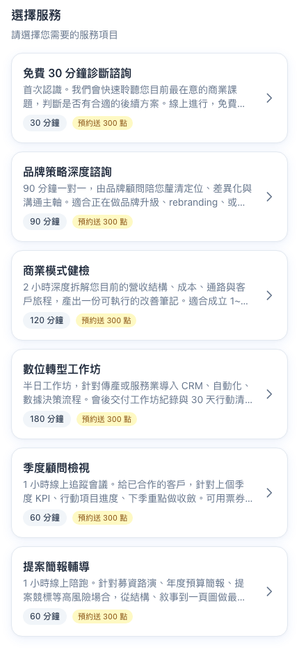
This suits:
- Established brand recognition (everyone knows what you do)
- Mostly returning clients (no need to reintroduce yourself)
- A minimal "tap in and book immediately" experience
Seeing what your clients see
Question: How do I see what my client interface actually looks like?
Two ways:
- Add yourself on LINE: add your business's Official Account from your personal LINE, then work through the menu
- Copy the public link into a browser: the Public link button at the top right of the admin gives you the LIFF URL; open it in a browser (outside LINE it asks you to sign in with LINE)
It's worth walking both routes for real, and doing so again every time you change a setting (services, messages, main visual), to confirm clients see what you intend.
Note: LIFF URLs can't always be opened directly in a browser
LIFF is LINE technology and strictly speaking is meant to be opened inside LINE. Pasting the URL into a browser sometimes prompts for a LINE sign-in — that isn't an error, it's LINE's protection.
When testing, working through it on your phone inside LINE is much closer to the real user experience than testing in a browser.
The layout width
The zenbu booking client interface is always presented at phone width. Even on an iPad or a desktop browser, the content is constrained to 480px and centered.
That's deliberate:
- Over 95% of real usage is on a phone (arriving from LINE)
- A fixed width means what you preview in the admin is what clients get
- It avoids content stretching and buttons looking odd on a desktop
Note: don't judge the design from a full-screen browser
What you should be looking at is how it appears on a phone. To preview, narrow the browser window to around 430px (iPhone Pro Max width), or use your DevTools device emulator.
The most accurate test is always to open it on your own phone from LINE.
Next
- The booking flow — the six steps after a client presses Start booking
- My bookings — where clients view, reschedule and cancel
- Points / Tickets — how clients see their own balances