Dashboard
The page you'll open most often after signing in. It gathers every important figure onto one dashboard so you know the state of the platform within 10 seconds.
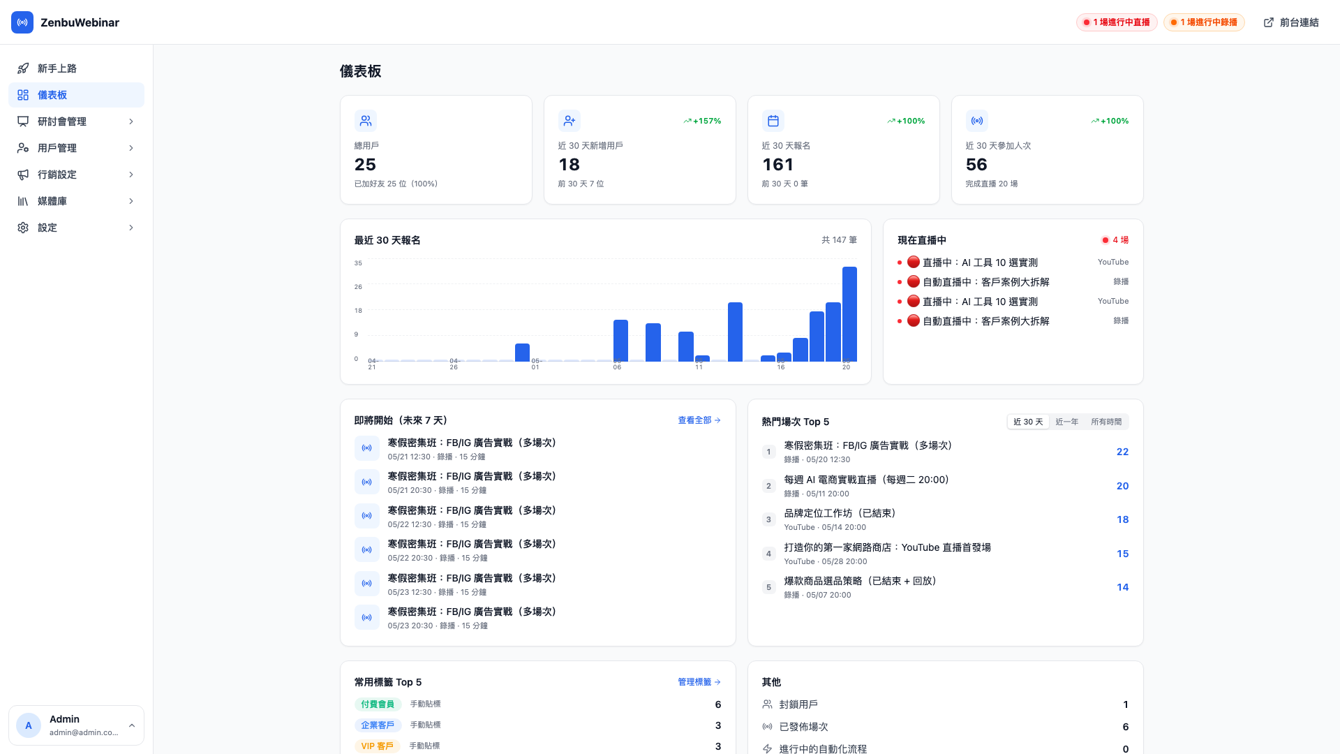
The four KPI figures
A row of four cards sits at the top, one metric each. The percentage in the corner is the change against the previous 30 days:
| Card | What it means | Supporting figure |
|---|---|---|
| Total users | Everyone in the system who has ever interacted (including blocked users and people who later unfriended you) | Friend rate |
| New users, last 30 days | Users who first appeared in the past 30 days | Growth against the previous 30 days |
| Signups, last 30 days | Signups across every session in the past 30 days | Growth against the previous 30 days |
| Attendances, last 30 days | People who actually entered the live room, or watched more than half | Full-view rate |
Use case: the first thing you look at on Monday morning
"18 new users last week (+157%), 161 signups over the past 30 days (+100%), 56 actually attended — growth is fine; let's use the meeting to decide whether to add a Q&A session." Ten seconds on the dashboard gives you the agenda.
Question: Why does the percentage sometimes read +100%?
+100% means the previous comparable period was 0 and this one has N — there was simply no data in the earlier window. It's common when you're just starting out or have only recently begun acquiring users; after a few months the curve settles into a sensible single-digit growth rate.
Question: Is "last 30 days" rolling or calendar month?
Rolling 30 days, counted back from the moment you open the dashboard. So "last 30 days" viewed on 4/15 covers 3/16 to 4/15. You won't see artificially small numbers at the start of a month.
Signup trend, last 30 days
The left half of the middle row is a bar chart, one bar per day showing that day's signups.
- Most used by whoever runs the ads: if a bar jumps the day after a campaign goes out, the campaign is working
- A flat or declining trend means it's time to check your traffic sources (the LINE rich menu, whether an ad creative has broken)
Click any bar to drill in and see which sessions contributed how many signups that day.
Live now
The right half of the middle row. If a session is live right now, it shows:
- The session title (with a red LIVE marker)
- The stream type (YouTube / pre-recorded / built-in / Meet…)
- A click straight through to that session's live messages page
If nothing is live, it's empty.
Coming up (next 7 days)
The bottom left is a schedule listing every published session in the next 7 days.
Each card shows:
- The session title (truncated)
- Start time
- Type (YouTube / Meet / pre-recorded / Zoom)
- Signups so far
Which lets you confirm quickly:
- Are the time and the source set correctly?
- Are there enough signups, or is it worth another LINE push?
- Are the reminder rules all configured?
Top 5 sessions
The bottom right lists the top five sessions by signup count, with three tabs:
- Last 30 days: what's popular this month
- Last year: sustained performers over 365 days
- All time: the full history
Use case: deciding what to run more of next quarter
Open the Last year tab and see that "Brand Positioning Workshop" has three times the signups of anything else — the market clearly wants this topic, so schedule two more like it next quarter.
The "live" / "playing" pills at the top
Two pills, red and orange, sit in the top right showing how many genuine live sessions and automated pre-recorded sessions are running right now. Click either to jump to the live messages page.
These pills update in real time — the numbers change as sessions start and end, with no need to refresh.
How this differs from Onboarding
Onboarding is a guidance page for new admins (demo data toggle, four-step checklist). The dashboard is the operating numbers for an admin whose platform is already running.
The two serve different purposes: Onboarding is getting started, the dashboard is day-to-day monitoring. Once the four onboarding steps are done, the dashboard becomes your regular working page.