Session detail & signup
This is the most important page your users encounter. Every signup link opens here first.
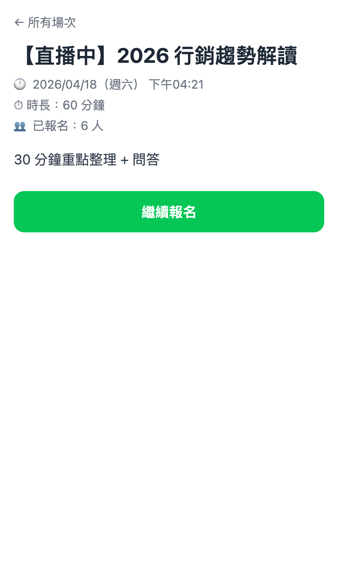
The page from top to bottom
| Block | Contents |
|---|---|
| Very top | A back button (returning to the session list) |
| Title area | The session name, possibly with a LIVE or Ended status marker |
| Basic details | Start time, duration, signup count (optionally shown) |
| Description | The session blurb you wrote in the admin |
| Occurrence picker | A dropdown, shown only for recurring sessions |
| Signup fields | Name / email / your custom fields |
| Primary button | The large green button: Sign up now, Enter live room, Watch replay and so on |
| Floating scroll hint | On mobile, an arrow guiding the user to keep scrolling to the signup button |
Recurring sessions get a picker
If the session is recurring (weekly / daily / multiple slots), the user first sees a dropdown to pick which occurrence to sign up for.
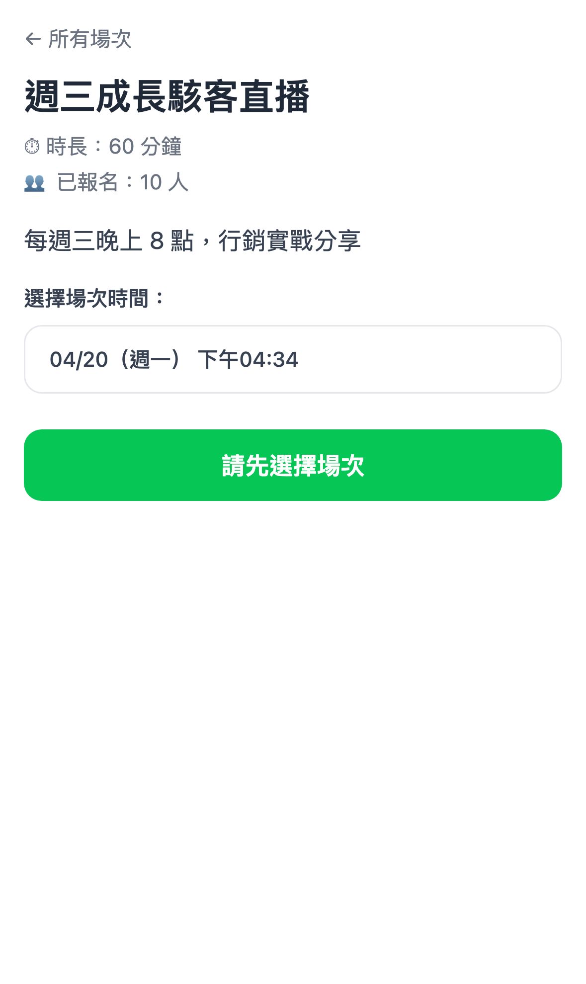
The picker remembers the time they chose last time and fills it in on their next visit, saving them the trouble of choosing again.
Use case: why let users pick a time?
Cheng-han streams the same topic at 8pm every Thursday. Hsiao-chi only sees the message on Saturday, and can't get away on Thursday — so she signs up for next week's occurrence.
The system records which occurrence she chose and only reminds her before that one. She doesn't have to remember to come back and sign up later.
The signup flow
Automatic signup (one tap)
If the user has entered their details before, or the session only needs their LINE identity with no extra fields, pressing the green button signs them up immediately and shows a thank-you toast: "✓ Signed up".
Extra fields → "Continue to sign up"
If the session has extra fields configured (company, job title, open-ended questions), the button reads Continue to sign up and opens the form.
Submitting shows a thank-you modal offering three choices: add to calendar, send me the live link, or keep browsing.
Use case: two approaches to fields
A free talk (minimal fields): name and email only. The fewer the fields, the higher the completion rate.
A paid workshop (collect everything): name, email, phone, company, job title, plus an open question — "what do you most want to learn?". Motivation is higher for paid sessions, so a few extra questions rarely cost you anyone.
"Send me the live link" after signing up
The thank-you modal has a Send me the live link button. Pressing it pushes a LINE message to that user:
✅ You're signed up for "Session name"
🕐 Starts: 2026/05/19 20:00
🔗 Enter here: https://...
They can scroll back to it in their LINE messages later, with no page URL to remember.
Cancelling a signup
Once signed up, the green button becomes a pale Cancel signup button. Pressing it opens a confirmation dialog, and cancelling restores the Sign up now button.
Question: Why did the older documentation say cancellation wasn't possible?
That was an earlier limitation. LIFF now offers a Cancel signup button directly, so students can cancel themselves without troubling your support team. The record disappears from Registrations in the admin in real time.
Live sessions: the three-way enter button
While a session is live, the green button becomes Enter live room and behaves differently by stream type:
| Stream type | What pressing the button does |
|---|---|
| YouTube | Opens the LIFF page with the YouTube stream embedded |
| Google Meet | Redirects to the Meet link (an external window) |
| Built-in streaming | Enters the built-in LIFF live room (with attendee camera features) |
| Pre-recorded | Opens the LIFF video player |
For attendees it's seamless — they don't need to understand the technical differences. The button always reads Enter live room, and the system takes them to the right place based on the session's configuration.
Ended sessions and replays
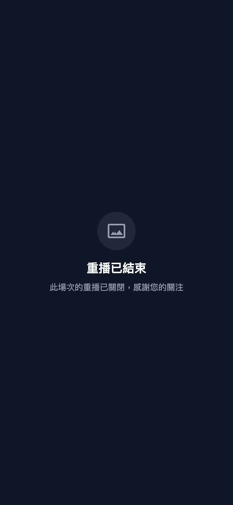
Once a session has played out and its scheduled end time has passed, entering the live room shows This stream has ended. Whether a replay follows depends on the allow replay viewing setting in the admin:

- Replay enabled → a Watch replay button appears, with Replay open until… below it if a window is set. Pressing it plays from the beginning.
- Not enabled, or expired → only the ended notice, not clickable; past the open period it reads Replay has ended.
What the replay room looks like
Pressing Watch replay opens the replay player, which differs from the live room:
- A gray Replay marker sits in the top left, not a red LIVE one — this is a recording, not something in progress
- A banner at the top reads Replay open until… with a live countdown, closing automatically on expiry
- If the admin allows scrubbing, the timeline can be dragged and fast-forwarded; otherwise it plays through in order only
- The chat / message panel appears only if the admin enabled show messages during replay; otherwise it's video only
Question: Do users need to sign up again for a replay?
No. A replay plays back existing content and isn't bound by the session's scheduled time — anyone already registered can press Watch replay and watch. (Admin previews aren't restricted at all.)
Question: Why do some ended sessions not even offer a replay?
Because allow replay viewing wasn't enabled for that session in the admin, or the replay window has expired. Whether replays are offered, and for how long, is entirely up to that session's settings.
The add-friend prompt
If whoever opens this page hasn't yet added you on LINE, an Add LINE friend button appears at the bottom automatically. Once they add you, every subsequent reminder is pushed to them over LINE.
The LIFF guard and deep links
Question: What happens if someone taps this link on a computer?
The system detects that it isn't inside the LINE app and redirects to the desktop guidance page, showing a QR code to scan with a phone that takes them back into the LINE app. The guidance text is customizable under General settings in the admin.
Question: Does tapping a link in a LINE message land on the right session?
Yes. The message pushed after signup contains a deep link, so tapping it takes the student straight to that session (occurrence ID included) without going via the session list.
The floating scroll hint (mobile)
Phone screens are small, and the description and signup fields can end up pushed a long way down. Whenever the user hasn't scrolled as far as the signup button, the system shows a floating arrow in the bottom right hinting that signup is just below.
The arrow disappears once they reach the bottom.